CONSTANT PRESSURE ANALYSIS CHARTS
Any surface of equal pressure in the atmosphere is a constant pressure surface. A constant pressure analysis chart is an upper air weather map where all the information depicted is at the specified pressure of the chart. The analyses are referred to as specific millibar (mb) charts or in metric nomenclature, hectoPascal (hPa) charts.
Twice daily, six computer-prepared constant pressure charts (850 mb/hPa, 700 mb/hPa, 500 mb/hPa, 300 mb/hPa, 250 mb/hPa, and 200 mb/hPa) are transmitted over the facsimile circuits. The valid times of these charts are the same as the radiosonde time, 12Z and 00Z. Plotted for the specified level at each reporting station is observed temperature, temperature-dew point spread, wind, height of the pressure surface, and the height changes over the previous 12-hour period. Figures 12-2 through 12-7 {12-3, 12-4, 12-5, 12-6} are sections of each constant pressure chart.
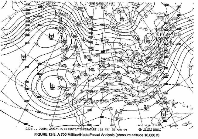
Pressure altitude (height in the standard atmosphere) for each of the six pressure surfaces is shown in Table 12-1. For example, 700 millibars/hectoPascals of pressure has a pressure altitude of 10,000 feet in the standard atmosphere. In the real atmosphere 700 millibars/hectoPascals of pressure only closely approximates 10,000 feet, either above or below 10,000 feet, because the real atmosphere is seldom standard. For direct use of a constant pressure chart, assume a flight is planned at 10,000 feet. The 700 mb/hPa chart is approximately 10,000 feet MSL and is the best source for observed temperature, temperature-dew point spread, moisture, and wind for that flight level.
PLOTTED DATA
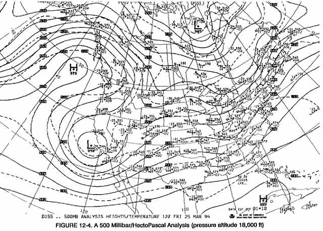
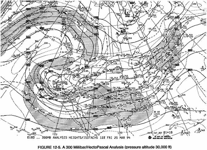
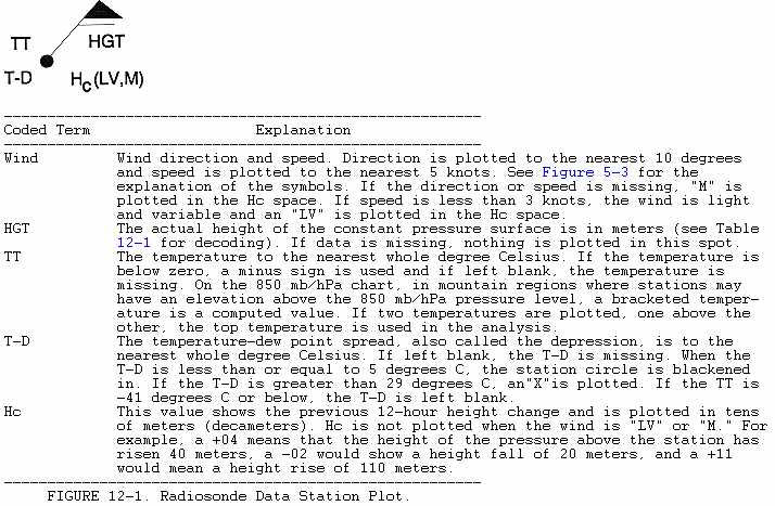
Figure 12-1 illustrates and decodes the standard radiosonde data plot. Table 12-2 gives a data plot example for each chart level. Aircraft and satellite observations are used in analysis over areas of sparse data. A square is used instead of a station circle to signify an aircraft report. The flight level of the aircraft is plotted in hundreds of feet. Temperature and wind data is also plotted for that flight level. The time of the report is indicated, to the nearest hour, UTC. For example, Figure 12-5 has an aircraft report at 40 degrees N and 140 degrees W. Decoded, the report indicates the flight level was 31,000 feet, the temperature was -47 degrees Celsius, winds were from 360 degrees at 20 knots, and the time of the report (to the nearest hour) was 1000 UTC. A star identifies satellite wind estimates made from cloud tops. Figure 12-4 is an example at about 41 degrees N and 62 degrees W. Decoded the report indicates that the height was about 19,000 feet, winds were from 260 degrees at 30 knots, and the time of the report (to the nearest hour) was 1100 UTC.
ANALYSIS
All charts contain contours, isotherms and some contain isotachs. Contours are lines of equal heights, isotherms are lines of equal temperature, and isotachs, are lines of equal wind speed.
Height Contours
Heights of the specified pressure for each station are analyzed through the use of solid lines called contours. This contour analysis gives the charts a height pattern. The contours depict highs, lows, troughs, and ridges aloft in the same manner as isobars on the surface chart. On an upper air chart, then, we speak of "high or low height centers" instead of "high or low pressure centers." Comparing a height analysis to a pressure analysis note that a contour high, low, trough, or ridge is analogous to a pressure high, low, trough, or ridge. Also note that the two terms may be used interchangeably as height and pressure analyses are just two ways of describing the same features.
Since an upper air chart is above the surface friction layer, winds for all practical purposes flow parallel to the contours. To decode contour values on the 850 mb/hPa through 300 mb/hPa chart, simply affix a zero to the end of the three-digit code. On the 200 mb/hPa and 250 mb/hPa chart, a one (1) must be prefixed to the three-digit code in addition to placing a zero at the end of the code.
Isotherms
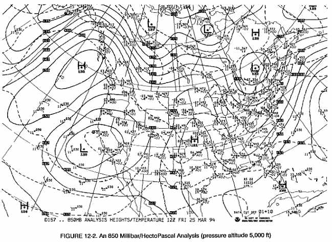
Isotherms are dashed lines drawn at 5-degree Celsius intervals. The isotherm analysis show the horizontal temperature variations at that chart altitude. Figure 12-2 is an example of a 850 mb/hPa chart. Note the dashed line extending from near Albuquerque, NM east to near Atlanta, GA and labeled "+ 10" in west Texas. This is the +10 degree isotherm. North of this isotherm, the temperatures, at approximately 5,000 feet, are below +10 degrees Celsius; and south of the isotherm, the temperatures are above +10 degrees Celsius. By inspecting the isotherm pattern, one can determine if a flight would be toward colder or warmer air. Subfreezing temperatures and a temperature-dew point spread of 5 degrees Celsius or less would indicate the possibility of icing. On the 300, 250 and 200 mb/hPa charts, the isotherms are the heavy dashed lines.
Isotachs
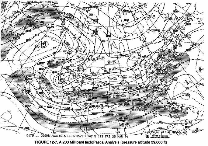
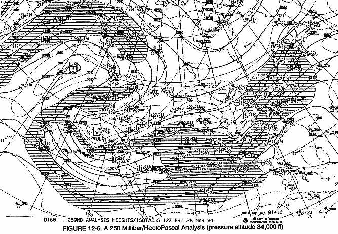
Isotachs, the short, lightly dashed lines, appear only on the 300, 250 and 200 mb/hPa charts. Isotachs are drawn at 20 knot intervals beginning at 10 knots. To aid in identifying areas of strong winds, hatching denotes wind speeds of 70 to 110 knots. A clear area within a hatched area indicates that the wind speed is between 110 and 150 knots. In Figure 12-6, note the alternating hatched/clear areas that extends from west of California into the south central U.S. The clear area, within the hatching, indicates winds greater than 110 knots, but less than 150 knots, while the small hatched area inside the clear area indicates winds greater than 150 knots.
THREE DIMENSIONAL ASPECTS
As established earlier, a height analysis may be treated as a pressure analysis. Closely spaced contours indicate strong winds just like closely spaced isobars. Winds blow clockwise around a contour high and counter-clockwise around a low.
Features on a synoptic surface chart and the associated upper air charts are generally related. However, a weak surface system often either loses its identity in a large scale upper air pattern or another system may be more evident on the upper air charts than on the surface chart. If fact, many times weather is more closely associated with an upper air pattern than with the features on the surface map.
As a general rule, a surface low is a producer of bad weather and a high is a producer of good weather. Usually this is true, but an upper air low or trough usually means bad weather, also. The area of cloudiness and precipitation found with an upper air low is usually associated with a surface low. Sometimes an upper level low with clouds and precipitation will move over a shallow surface high with corresponding bad weather in the high. As with a surface high, an upper air high usually means good weather. An exception would be an upper air high or ridge that has a stabilizing effect on the layers of the atmosphere below it. Smoke, haze, dust, low stratus, and fog may persist for an extended period but the surface map shows no cause for the restriction.
Lows generally slope to the west, toward colder air, with ascending altitude for developing low pressure systems. Due to this slope, winds aloft with an upper system often blow across the associated surface system. Surface fronts, lows, and highs tend to move with the upper winds. For example, strong winds aloft across a front will cause the front to move rapidly, but if upper winds are parallel to a front, it moves slowly, if at all.
An old, nondeveloping low pressure system tilts little with height. The low becomes almost vertical and is clearly evident on both surface and upper air maps. Upper winds encircle the surface low, rather than blow across it causing the storm to move very slowly. As a result, extensive and persistent cloudiness, precipitation, and generally adverse flying weather occur. The term "cold low" describes such a system and is usually identified on the surface chart as an old, occluded low with the warm air having been cut-off from the low pressure center.
In contrast to the cold low is the "thermal low". A dry, sunny region becomes quite warm from intense surface heating. This results in a surface low pressure area. The warm air is carried to high levels by convective currents, but very few clouds occur because of the lack of moisture. This warm surface low often is "capped" by a high aloft. Unlike the cold low, the thermal low is relatively shallow with weak pressure gradients and no well-defined cyclonic circulation. However, be alert for high density altitude, light to moderate convective turbulence and isolated showers and thunderstorms if sufficient moisture is present. The thermal low is a semipermanent feature of the desert regions in the southwestern United States and northern Mexico during warm weather.
These are only a few examples of associating weather with upper air features. They point out the need to view weather in the three dimensions to get a "big picture" of the atmosphere. This is the first step in understanding the atmosphere and its associated weather.
USING THE CHARTS
From these charts, a pilot can approximate the observed temperature, wind, and temperature-dew point spread along a proposed route. A constant pressure chart usually can be selected close to a proposed flight altitude. For an altitude about midway between two charted surfaces, interpolate between the two charts. Determine temperature from plotted data or the pattern of isotherms. To find areas of high moisture content, look for reports that have the station circle shaded. This indicates a temperature-dew point spread of 5-degrees Celsius or less. A small spread indicates the possibility of clouds, precipitation, and icing.
Wind speed from the 300, 250, and 200 mb/hPa charts can be determined by the isotachs. Below this level, wind speeds can be determined from the plotted data.
As stated earlier, constant pressure charts often show the cause of weather and its movement more clearly than does the surface map. For example, the large scale wind flow around a low aloft may spread cloudiness, low ceilings, and precipitation far more extensively than indicated by the surface map alone.
Note: Keep in mind that constant pressure charts are observed weather.